Brand Identity and Mascot
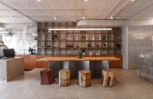
At Another D Studio, we believe that a brand’s identity is deeply rooted in the values of its founders. For the brand Workerbee, which communicates through regionally produced honey, our goal was to expand and deepen its identity beyond products and services. Central to this identity is the brand’s mascot, ‘Kerbee,’ which embodies the messages of ‘Save the Bees’ and ‘Honey makes it better.’ Kerbee, though not physically present, adds vitality to the brand as its mascot.
Concept and Design Approach
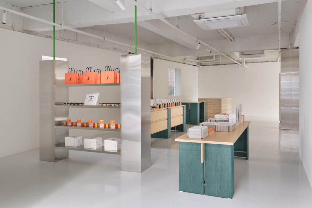
The House of B Store, formerly a hospital and house, has been reimagined as a place that embodies the brand’s ethos—termed as ‘MANSION’ and ‘VILLA.’ Each building reflects a distinct concept: MANSION focuses on expanding the brand image, while VILLA serves as the home of Kerbee, imbued with personality and warmth.
MANSION: Expanding Brand Image
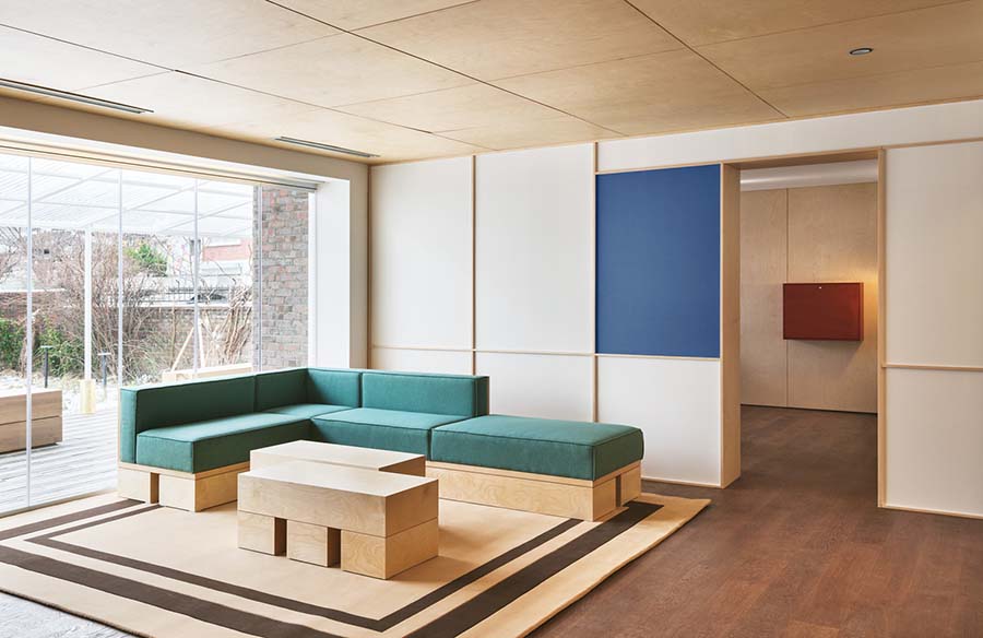
The three-story hospital building, designated as MANSION, showcases the modern interpretation of Workerbee’s brand identity. With its red and natural wood structure set against clean, open spaces, MANSION embodies the brand’s elegant and powerful appearance. This space acts as a canvas for endless creative possibilities, expressing the brand’s existing colors in a refined manner.
VILLA: Embodying Kerbee’s Persona
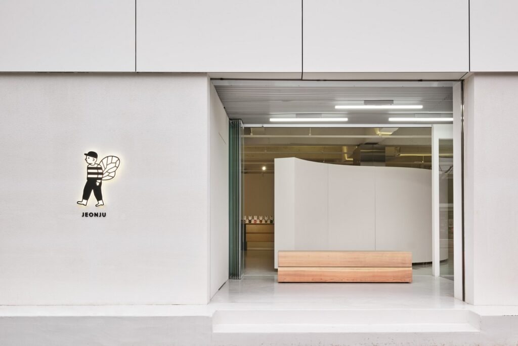
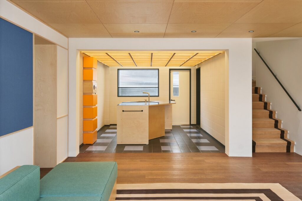
Adjacent to MANSION, VILLA is the home of Kerbee, designed to reflect the mascot’s persona. Every design decision was made with Kerbee in mind, ensuring that visitors feel welcomed and immersed in Kerbee’s world. Dark wood flooring, patterned tiles, and brick accents create an atmosphere that resonates with Kerbee’s taste and style. Kerbee’s garden offers a serene retreat, evoking a countryside ambiance for visitors.
Integrated Space Design
A connected passage links MANSION and VILLA, creating a cohesive experience that blends the distinct identities of both spaces. The design ensures fluid circulation through vertically and horizontally divided areas, unifying the two buildings into a single cohesive unit. This integrated space deepens the brand’s story, organizing Workerbee’s colors and motifs throughout.
Conclusion
The House of B Store by Another D Studio represents a unique fusion of brand identity and architectural design. By reimagining two historical buildings, we’ve created a physical space that not only showcases the Workerbee brand but also enriches the brand’s narrative. This space serves as a platform to communicate the brand’s values and messages, making the brand experience tangible and immersive for visitors.

